Distrikt
The Brief:
The project:
Project Summary


Distrikt is a new pop-up venue for Brighton Fringe 2016, offering a mixed programme of theatre, dance and comedy. Run by Dv8 Events Company, a group of Event Management Students studying in Brighton, the venue is located in a former Church and will seat up to 110 people, plus have a separate bar operating across the 10 days that the venue is open for.
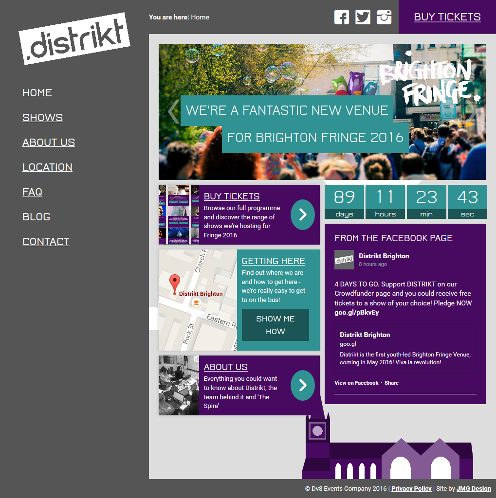
As a new venture, Distrikt needed a visual identity and an online presence. Working alongside the venue team with the colour palette provided to me, I was asked to create a logo and a website. The logo would need to be clear, memorable and simple because of the variety of contexts in which it would be used, and the website had to be appealing, responsive for viewing on different devices and very easy to use and manage.
After much discussion and several drafts to get something that the whole team liked, I produced the logo that you can see on this page and on the Distrikt website. The flat design allows it to be used in any of the venue’s colours and it works well across both digital and printed media; the cut-out style lending itself to being comfortably placed on top of coloured backgrounds and images.
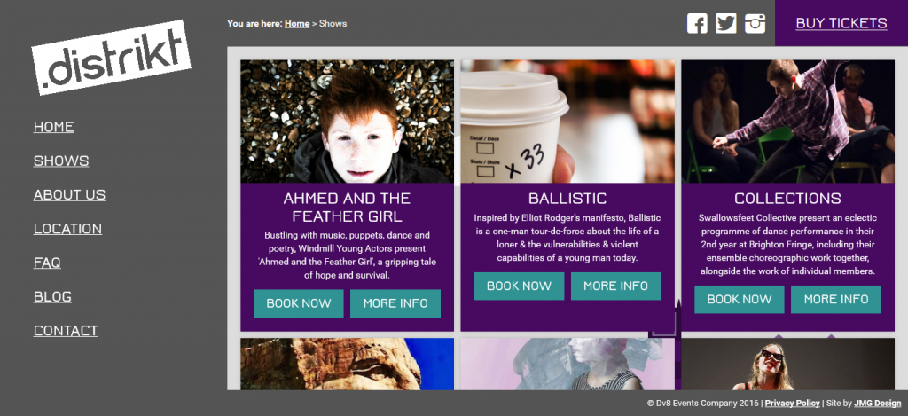
The website utilises a range of styles that are meant to be unique and a little quirky – such as the static header, sidebar and footer that create a permanent frame for the rest of the content, and fun finishing touches like the loading strip at the top of the page. The website is designed to feel almost ‘app’ like in style, presenting a very professional image whilst having a bit of fun and deviating from common design patterns and trends.
Project Summary
| Project type: | Logo & Web Design |
| Client: | Dv8 Events Company |
| View live project: | www.distriktbrighton.co.uk |
A website is never really ‘finished’. Once the design and build process has been completed, you’re most of the way there – but there are likely still to be times where something needs changing, modifying or adding to. Whilst you’ll have access to edit your website’s content yourself, it’s never nice to be left on your own – so I provide a support service to help out with small changes and tweaks as they become necessary. I’ll periodically install the latest feature and security updates for you, and if anything ever goes wrong or if you just need a hand – I’m only an email away.
I build all my client’s websites in WordPress, an open source content management system. WordPress is the software that runs the site, allowing for much more complex features than a static site. It allows you to login, update content easily and make changes without coding. Over 70 million websites are using WordPress, and because it’s open source it’s constantly being added to, updated and developed. This means that it’s very secure, stable and well supported.
The WordPress CMS platform is incredibly powerful. There are thousands of extensions and extras that can be added to your site to give it extra functionality, and it means that your site is always easy to extend. On top of unlimited pages and content, I can incorporate more advanced functionality into your new site, such as contact forms, image galleries and even E-Commerce Systems.
Websites are now a crucial part of running a business or organisation – making it easy for people to find out who you are, where you are and what you do is hugely valuable. What doesn’t look so good, is a website with outdated content. I make editing and updating your website really easy, since I use the WordPress Content Management System. All you have to do is login, edit a page as though it’s a word document, and save your changes. All done. Finished. Simple.
You’re unique, and I believe that your website should be too. I don’t use pre-built templates, and instead I create a design and layout that fits your business/organisation more personally. Not the same as anyone else’s website, but designed and built just for you, using your logo, images, colours brand and style. If you’ve got an established ‘brand image’ then I’ll work within your guidelines, or if you want something new then I’m always happy to get stuck in and create something fantastic.
Your website visitors won’t just be browsing your site on a desktop PC or laptop. They’ll use all manner of different phones, tablets and other devices, and it’s important they’re all kept happy. That’s where responsive design comes in. It allows a website to scale nicely to fit the screen size it’s being viewed on, optimising the layout and content for the device. No more zooming in and scrolling to read text – just a smooth, well designed mobile browsing experience.